


Start with a graph with a large x-axis range of data – the x axis looks unrealistic:
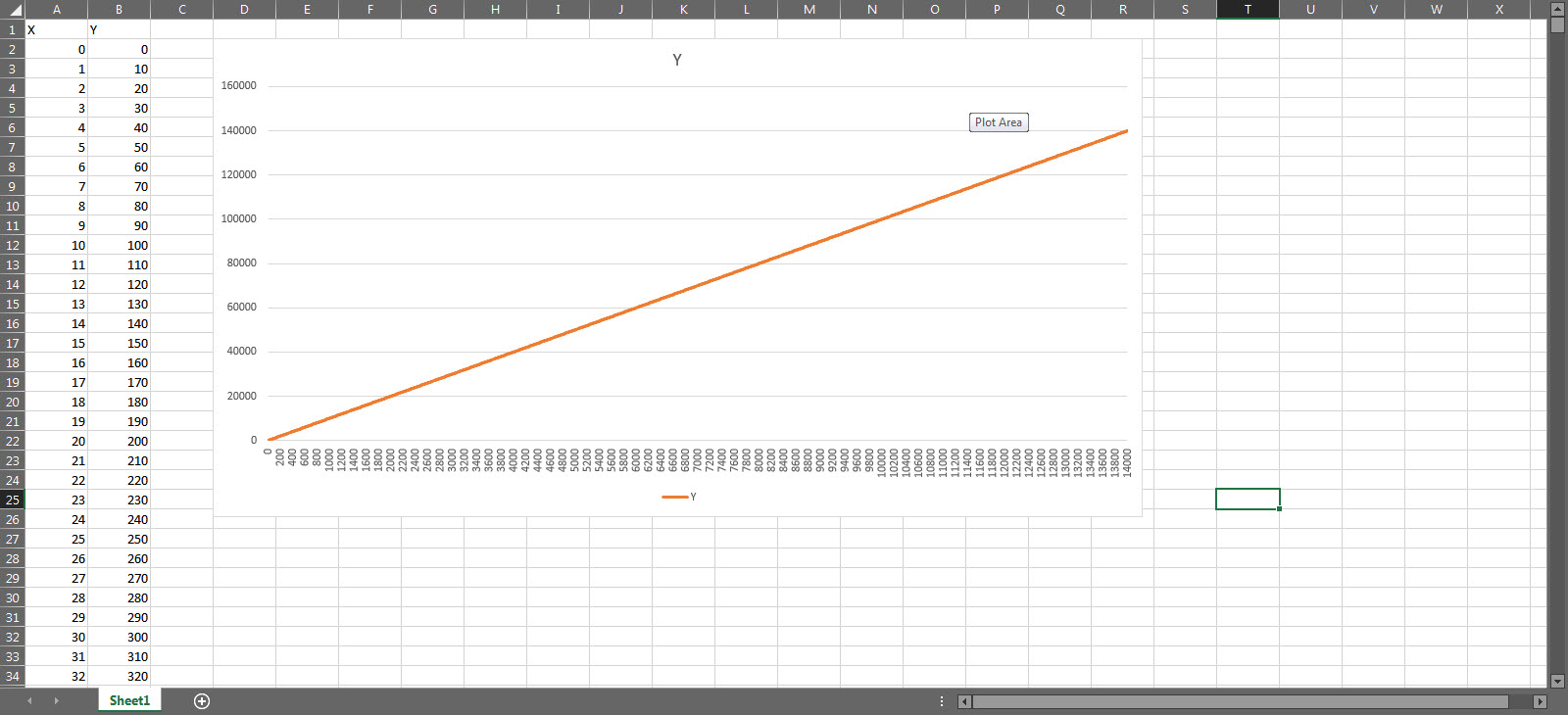
Need to set a more realistic x-axis label separation, but limited to upto 255 separation in Excel 2016.

Change x axis data type to date

Then change both the marker types to days, and set the major and minor units to say 1000 and 1 respectfully – now the graph axis look more realistic.
